There is often a false narrative circulated that the city of Chicago as a whole is a dangerous place, specifically when it comes to homicides. However, data indicates that the balk of homicides is actually spread more unevenly throughout the city with the violence heavily concentrated on the West and South Side.
Using the city of Chicago’s Data Portal, we have crunched some numbers to give readers a look at where homicides are actually coming from. For simplicity, we filtered the data to include all homicides since January 1, 2019. Let’s take a look at Figure 1 below.
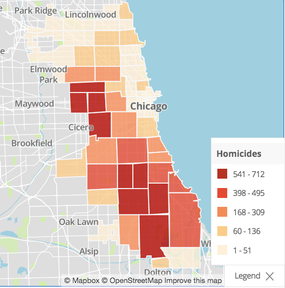
Figure 1 above is a heat map that illustrates the level of homicides in the city based on zip code. The darker the color (red) the more homicides present. Consequently, the brighter the color (yellow) the less amount of homicides. The purpose of this map is to just provide a visual.
We can get more specific and assess the numbers more closely based on zip code. However, the illustration as is serves it’s purpose. Let’s instead get more political and break down the data via wards.

Figure 2 above illustrates the number of homicides for each of Chicago’s 50 wards since 2019. Notice the disparity among wards with high levels of homicides and those that do not. About 15 percent of all reported homicides since 2019 actually came from just two wards, the 28th and 24th. Those two wards are located on the West Side of the city.
As for the Southside, it seems homicides are heavily concentrated around wards 16 (Englewood), 6 (East Chatham), 8 (Chatham), 9 (Pullman), 7 (Stoney Island), and 20 (West Woodlawn).
Let’s take a look at those numbers a little more closely.

Figure 3 above illustrates the top 10 wards that had the most homicides since 2019. Not surprisingly, all of these wards are located in either the West or South Side of the city. An outlier, however, is ward 27 (Old Town). This ward is located west of the Golf Coast and east of Goose Island north of the loop. Figure 4 below provides a better illustration of all of the wards.

Figure 4 above is more or less the same map as Figure 1, except it has been filtered to illustrate where homicides are occurring in each of Chicago’s wards, instead of zip codes. Although the filter has been slightly tweaked, the trend remains the same: the majority of homicides in the city of Chicago since 2019 have been heavily concentrated on the West and South Side of the city.
This is not to say that crime is unapparent throughout the city, but point out that some neighborhoods are safer than others, and by a wide margin. Additionally, the findings can provide a roadmap towards alternative policy discussions, such as why violence is so heavily concentrated in these neighborhoods and how to fix it. Public issues are often more nuanced than the common perception.
